
The new fully revamped Hepsia Control Panel is now officially out
 The new version of the Hepsia Control Panel, which has been running in beta mode for a few months now, has just been launched officially throughout our network of partners and their clients.
You and your customers can now leverage of a fully reworked dashboard, which features a sleek design and offers a much simplified interface for managing your projects.
Learn more about the new version of the Hepsia Control Panel and the key benefits of its renovated look and feel.
What brought the new Hepsia revamp forward?
Oftentimes, you need a new perspective on things in order to make the most of what you have. This is what inspired our Hepsia revamp project.
Apart from following the latest UI trends, we wanted to make sure that users get the most straightforward site and email management experience.
The Hepsia Control Panel is the most important point of contact between your customers and your web hosting and domain name registration services.
This is why, we wanted to give its dashboard a new, more intuitive look, which would make the most useful features and functionalities stand out and would let users easily find what they are looking for while managing their projects.
It took us more than a year of development and testing to reach the sought-after fine balance between user-friendliness and technical complexity.
Yours and your customers’ feedback was a valuable guiding light along the way.
After releasing the beta version of the new Hepsia in the beginning of 2018, we tried our best to take all of yours and your customers’ comments and opinions into account as well.
The outcome of our mutual effort is now a more intuitively organized, entirely user-centered Control Panel solution that could help you stand out in the cookie-cutter web hosting market.
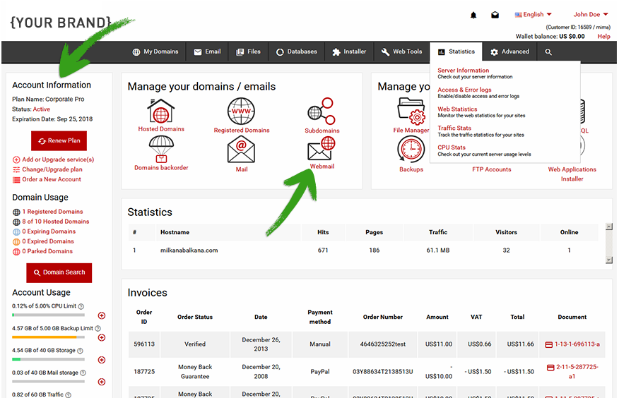
Hepsia revamp – a touched-up dashboard design
The new dashboard adds up to Hepsia’s time-proven look and feel by offering a smooth and fresh appearance.
The separate sidebar boxes have been merged into one element for a more complete perception.
The body itself has been completely rearranged to allow for a more intuitive interaction with the most used site/email management controls.
The selection of icons has become more concise and now includes the most-used ones only:
![]()
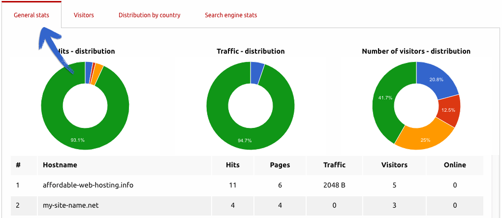
For a more visually appealing representation of the activity on your site(s), we’ve improved the looks of the Statistics section:
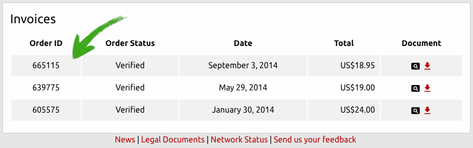
Below it, we’ve included a summary of the invoices issued to each customer, so they can easily keep track of their purchase history anytime they log into the Control Panel:
We’ve also reworked the header area for a cleaner presentation of the various options included there.
You will notice that the Visit Store link has been moved to the right so as to free more space for your store’s logo.
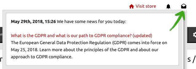
Also, the Inbox has been split in two, so that you could follow up on the latest news and system notifications more easily:
We’ve made the theme and language settings more visible so as to make it easier for users to control them.
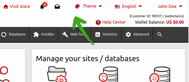
The Help icon is now much easier to locate than before, giving users a one-click access to Hepsia’s newly re-organized Help Center.
By clicking on their name, users will see a list of all the options that were featured in the My Account section of the old Control Panel:
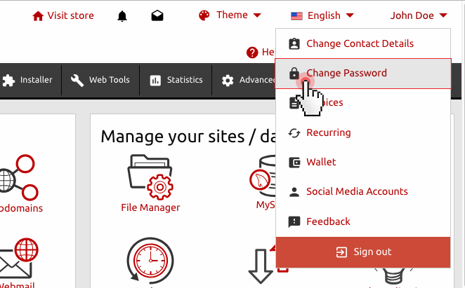
Now users can update their account details, change their password, update their wallet or manage their recurring contracts with a click of the mouse.
The social media login, feedback and logout options have also been included there for the sake of convenience.
Hepsia revamp – a fully responsive design
Hepsia’s mobile version has now been replaced with a full-blown responsive design solution.
Users will now officially have impeccable access to their hosting/domain management dashboard from any device at all.
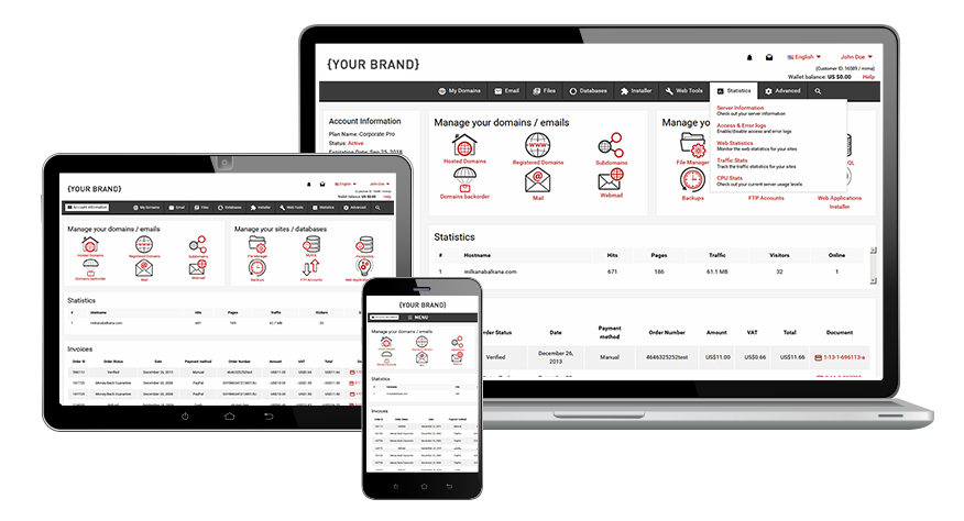
The fully responsive framework offers a smooth transition between different devices, making sure that the user will get a complete Control Panel experience no matter whether they are using their PC or mobile phone.
For instance, when accessing the Control Panel from their tablet or mobile phone, users will be able to easily bring up an additional sidebar via the handy ‘Usage’ tab on the left side.
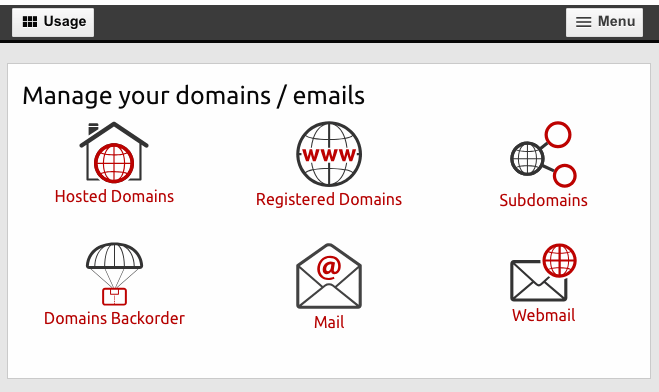
Accessing the various options in the header area will be just a click away via the ‘Menu’ tab in the upper right corner of the screen:
Hepsia revamp – back-end improvements
In order to synchronize the new light look of the Control Panel with the way it feels in users’ hands, we have made a lot of improvements to the back-end framework.
A series of test simulations have been made with the File and Email Managers to ensure an even smoother experience with the most visited areas of the Control Panel.
As a result, users will now be able to execute all manner of file management operations and administer their mailboxes much easier and faster than before.
Hepsia revamp – a fully reorganized Help Center
Building up on yours and your customers’ feedback over the years and following the latest UI patterns, we have reorganized the help area to shorten the user’s path to finding a solution to the particular problem they are having.
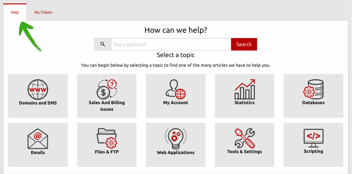
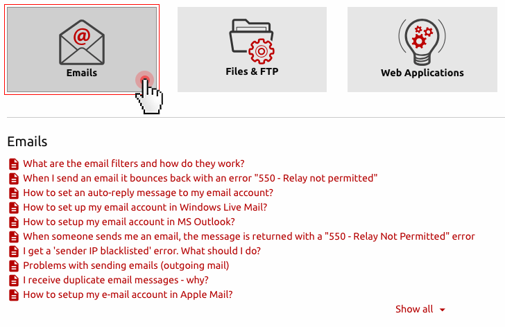
By clicking on the Help Center link in the top right corner, the user will be taken to a page that contains a collection of help articles and tutorials, which can give them a practical solution:
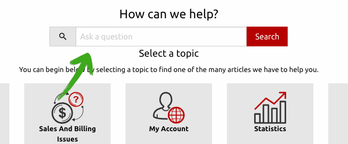
For the sake of convenience, a search field has been included to help the user find a solution to their issue:
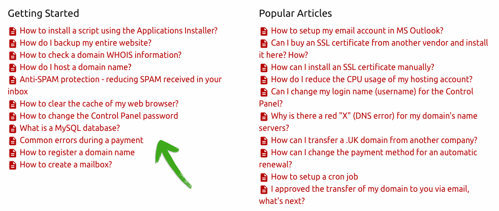
Also, we’ve listed articles that each beginner would be interested in and featured a selection of the most popular help articles on our platform:
When clicking on a specific category, the user will see all the help topics that are currently available and will also be able to search for a particular issue – if that list is too long:
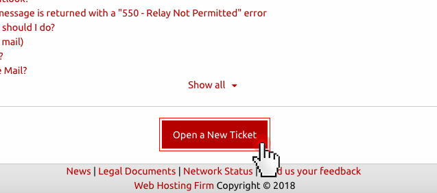
In case the user hasn’t found a response to the question or issue they are having, they can easily ask for help by clicking on the ‘Open a new ticket’ button at the bottom of the list.
NOTE: We are putting the final touches to a brand new contextual help functionality, as well as to a new selection of video tutorials in tune with the new design, so stay tuned for more updates later on.
***
Starting from today, you and your customers will be automatically redirected to the new version of the Hepsia Control Panel.
A link to the legacy version will be still available to those of you who need more time to get used to the new look and feel of the dashboard.
Originally published Friday, June 8th, 2018 at 4:39 pm, updated June 8, 2018 and is filed under Hepsia Control Panel.